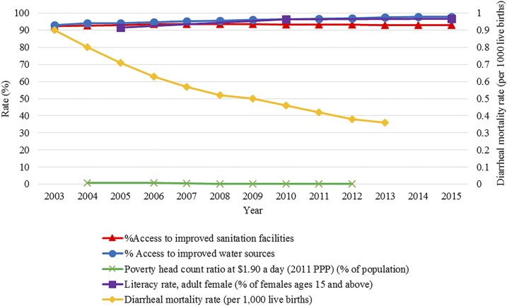
Figure 5.
National trends in pertinent contextual factors. A collection of typhoid relevant contextual factor trends are shown from 2003 to 2015. The orange line shows the percentage of the country with access to improved sanitation facilities. The blue line represents the percentage of the population with access to improved water sources. The green line shows the percentage of the population living on less than $1.90 per day. The purple line shows the percentage of literate females aged 15 years and older. The yellow line captured on the secondary x axis shows the diarrheal mortality rate per 1,000 live births at the national level.

