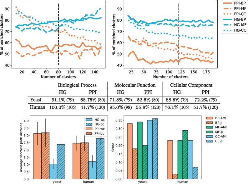
Fig. 8.
The top panels give the average percentages of clusters enriched with respect to the total number of clusters for yeast (left) and human (right), the standard deviation is not represented to avoid overcrowding the panels. The colours represent the models from which the clustering is obtained: HG in blue and PPI in orange. The type of line represents the category of GO annotations: BP are full lines, MF are dashed lines and CC are dotted lines. The black vertical lines denote the number of clusters selected from the set of NMI and SSE curves according to the procedure described in Section 3.4.1. The middle table presents the maximum enrichment measured across clusterings obtained with the ‘optimal’ number of clusters (denoted by the black vertical lines in the top panels). The number in parenthesis is the number of non-empty clusters. All enrichments are significant. The bottom left panel gives, for each type of model (HG in blue and PPI in orange), the average of the shortest path lengths within the clusters (wc) and between clusters (bc) of the best clustering obtained for GO-BP annotations. The results are similar for other GO categories and are not presented here due to space limitations. The bottom right panel represents the results of the comparison of the obtained clusterings. We use the HG clustering as baseline and compute the AMI between the clusterings and the JI between the sets of enriched GO terms

