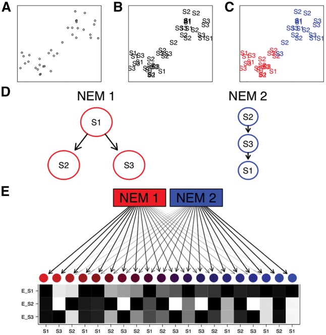
Fig. 1.

A schematic example of an M&NEM. Two dimensional projection of single cells (A), labeled by known knock-outs of signalling genes S1, S2 and S3 (B) and colored by their two clusters (C) on which the two different causal networks are based. (D) Comparing two different networks (NEMs) according to the clustering. S1, S2 and S3 are the perturbed genes and the edges denote how they causally influence each other. (E) 20 noisy cells attached to each NEM according to their responsibilities with their respective data patterns (black for effect and white for no effect). Each row shows the effect pattern for the respective S-gene, e.g. E_S1 shows the effects of S-gene S1 for different cells. Each column shows the expected data pattern for a cell. The colors and arrow transparencies depict the strength of attachment to the respective NEM. For example the bright red cell to the far left is attached to NEM 1 with responsibility 100%. Thus the pattern for the cell is the expected data pattern according to NEM 1 without any noise. The cells in the center are a mix of expected data patterns of cells for NEM 1 and NEM 2
