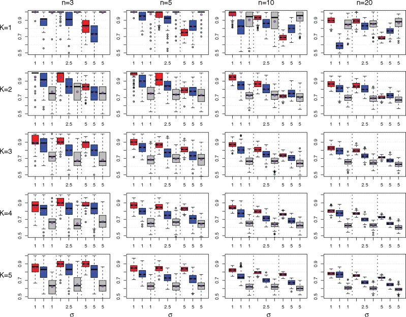
Fig. 4.
Comparison of M&NEMs (red), cNEMs (blue) and NEMs (grey) in a simulation study. The rows show results for components . The columns show results for number of S-genes . Each box plot shows the accuracy of M&NEM (red), cNEM (blue) and NEM (grey) for three different noise levels σ. The y-axis is cutoff at 50% (random). In addition to the median we also added the average (red star in blue circle)

