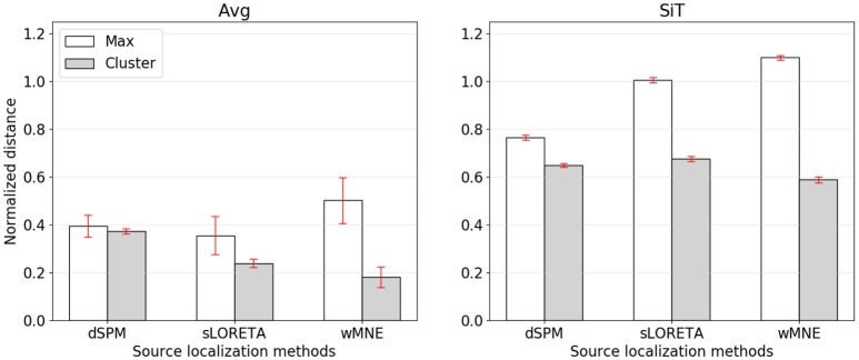
Figure 5.
Normalized distance from the reference region to the position of maximal activity (white bars) or to the COM of the nearest cluster (gray bars). The left graph corresponds to source reconstruction on averaged data (Avg), the right to source reconstruction on single-trials (SiT). To normalize the distance to the maximum it was divided by 74.9 mm which corresponded to the average distance of randomly sampled source distributions with one cluster.

