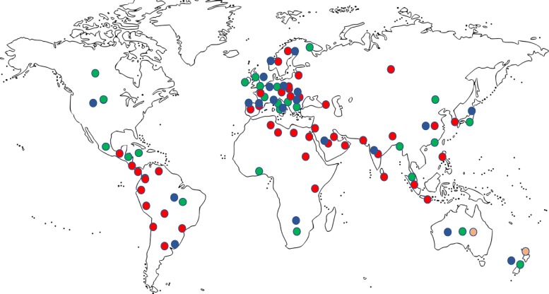
Fig. 1.
Map of various critical care societies registered with WFSICCM. Regions where societies responded to the WFSICCM survey in green. Survey data not available from regions in red. Areas in orange are those from which precise longitudinal data on gender representation were available. Areas in blue indicate regions with more than 500 registered members in the society

