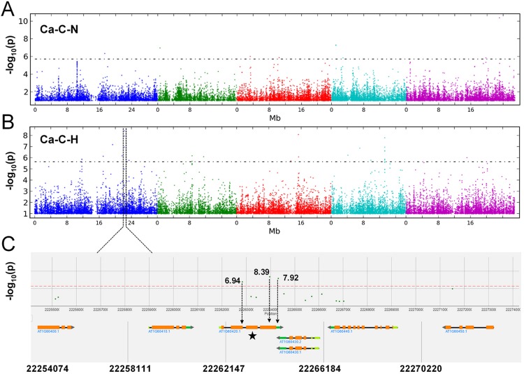
Figure 5.
Manhattan plot illustrating the GWAS mapping of the Ca concentration in 388 Arabidopsis accessions grown under supply of normal (1,000 µM) (A) and high Mg2+ (10,000 µM). (B) Chromosomes are shown in different colors. (C) Detailed plot of the region shown in the red box in (B). The positions on the chromosome are on the x axis and the score on the y axis. The dots in the scatterplot represent SNPs. A horizontal dashed line shows the 5% threshold.

