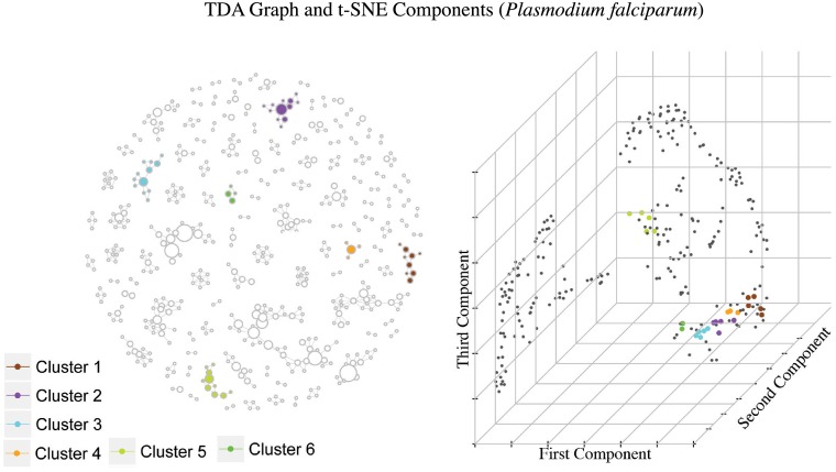
Fig 5. Graph constructed using TDA and t-SNE component plot using the epidemic occurrence vectors, where selected groups have been highlighted.
These groups were selected by high overall disease intensity and high epidemic rate. Each cluster can be interpreted as a group of municipalities with Plasmodium falciparum incidence that have similar temporal behavior. Notice how the colored dots in the component plot are somewhat grouped together and since these represent municipalities with high epidemic rate, we have highlighted locations with several positive entries in the occurrence vector distributing differently across time.

