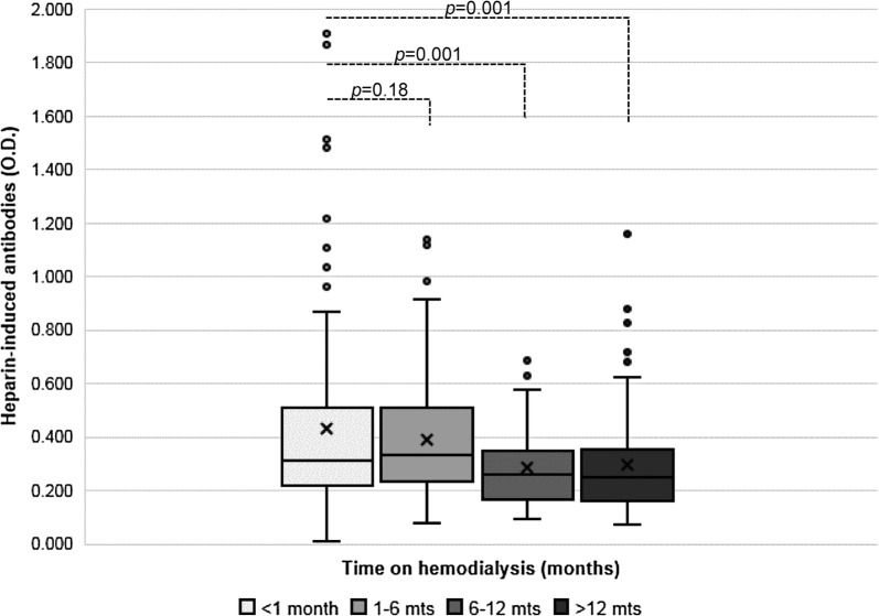
Fig. 3.
Plot of all HIA levels (OD) stratified by time and compared for significance. The box plots show the 25th percentile to the 75th percentile, with the midline representing the median and separating the two quartiles. The first whisker (below) shows the lowest 25%; while the second whisker (upper) shows the top 25%, excluding outliers. The mean OD is denoted by the “X” marker. Outliers are designated by values greater than 1.5 times the interquartile range. A significant decline in OD was noted after 6 months

