
Fig. 3.
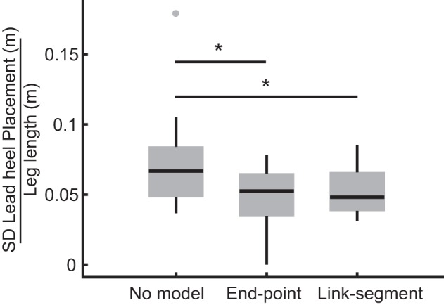
Box and whisker plot illustrating leading foot placement variability. Horizontal lines within each box indicate median values, and bottom and top boundaries of the box indicate the 25th and 75th percentiles. Points outside each box indicate outliers. Asterisks denote significant differences at the Bonferroni corrected P < 0.05 level.