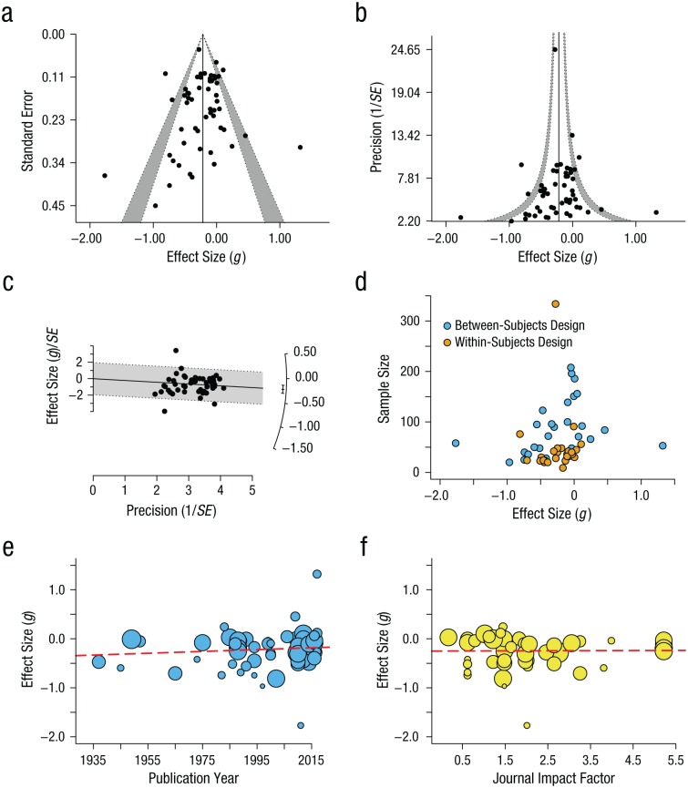
Fig. 3.
Visual assessment of publication bias and other related biases in the literature on reading-comprehension accuracy (presentation format adapted from Nakagawa, Noble, Senior, & Lagisz, 2017, Fig. 6). The funnel plots show (a) standard error and (b) precision (i.e., the inverse of the standard error) as a function of effect size. The white area within the gray bounds shows the 95% pseudo-confidence interval; the gray bands extend this area to the 99% pseudo-confidence interval. (See the main text for information on how to interpret funnel plots.) The vertical lines indicate the pooled effect size, as estimated from a random-effects meta-analysis. The radial or Galbraith plot (c) shows the z statistic (i.e., the effect size divided by its standard error) of each study as a function of precision. The arc on the right side of the plot corresponds to the size of the individual observed effects. The interval next to the arc shows the pooled effect size and its 95% confidence interval. The gray area highlights the region in which z values between −2 and 2 lie and is the same as the approximate 95% confidence interval; on average, 95% of the studies are expected to fall within this range (Anzures-Cabrera & Higgins, 2010). The vertical scatter of effect sizes shows the degree of heterogeneity in the data. The scatterplot in (d) shows the relationship between effect sizes and sample sizes, broken down by study design type (i.e., between subjects vs. within subjects). The scatterplots (with best-fitting regression lines) in the bottom row show the results of metaregression models examining the relationship (e) between effect size and publication year and (f) between effect size and impact factor of the journal where the study was published.

