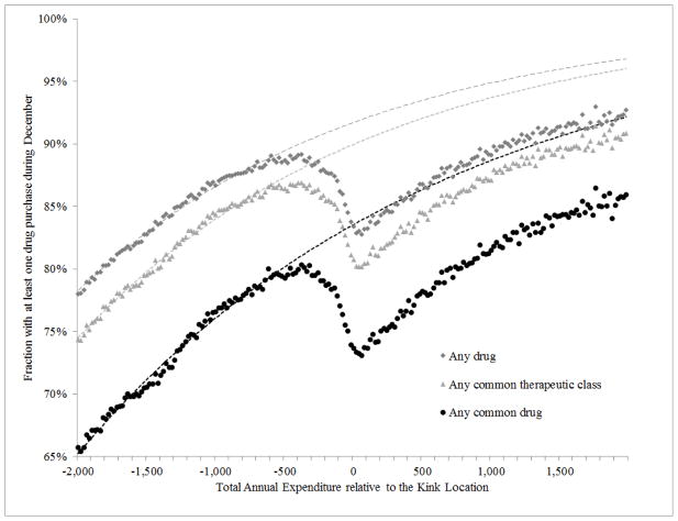
Figure 2. Claim propensity in December as a function of annual spending –pooled estimates.
These three graphs plot the share of individuals within a $20 dollar spending bin that filled a claim in December for (i) any drug - marked with dark gray squares; (ii) any common therapeutic class - marked with light gray triangles; or (iii) any common drug - marked with black dots. The top scatter plot for “any drug” is an updated version (that is, additional years of data are included) of Figure V in Einav, Finkelstein, and Schrimpf (2015). The spending bins are recorded on the x-axis; the spending is calculated as relative to the kink location in the corresponding year. Each of the three dotted lines plots predictions from a regression described in Section II.B, which is fitted using observations that are to the left of $500.

