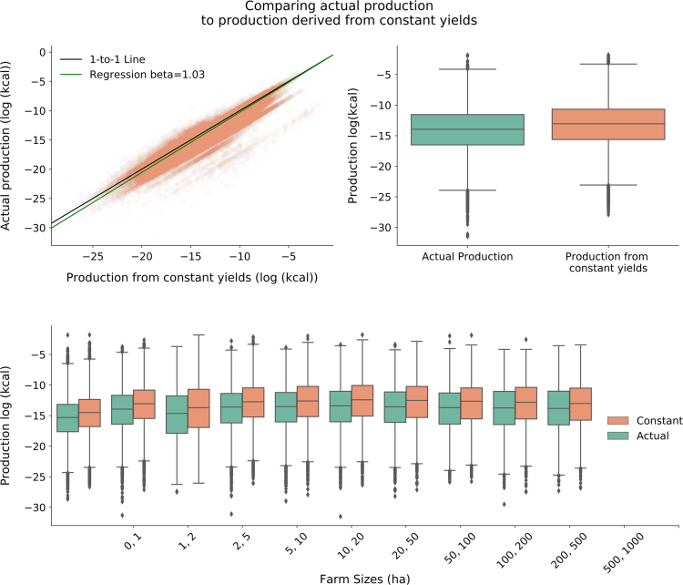
Fig. 6.
Verifying our constant-yield assumption through comparing production calculated using constant yields versus actual production for countries where we had both area and production data by farm size. A) Log-log plot between constant yield calculated production and actual production. Black line represents 1-to-1 line. Green line is the linear regression line when using constant yield derived production to predict actual production. B) Compares production using constant yields (orange) to actual (green) production on a log-scale, while C) shows this relationship for each farm size class.

