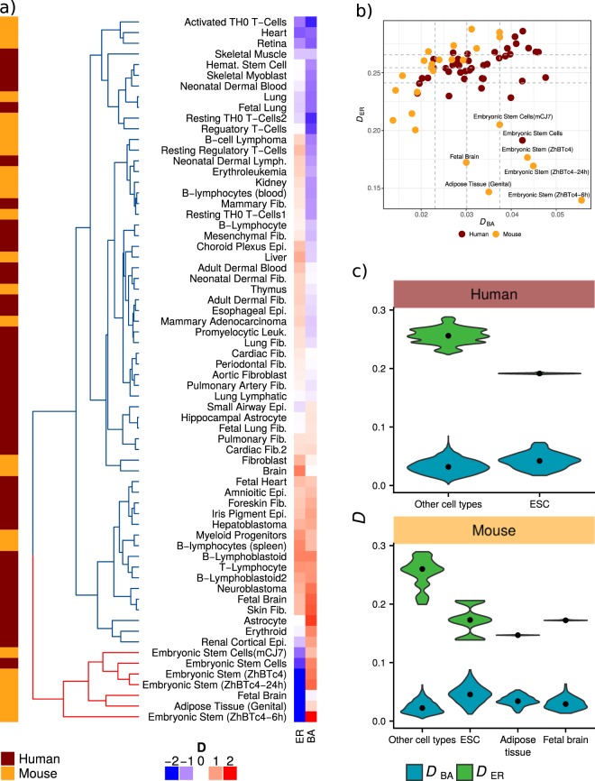
Figure 4.
Networks comparison with ER and BA model networks. (a) Heatmap human and mouse cell types dissimilarity to model networks. (b) Scatterplot of cell types dissimilarity to model networks, dashed lines in both axis correspond to the 25, 50 and 75 percentiles of both measurements. (c) Distribution of D values for ESCs and other cell types in human and mouse, respectively. Distributions correspond to the dissimilarity with each of the 100 simulated model networks, black dots correspond to distribution median.

