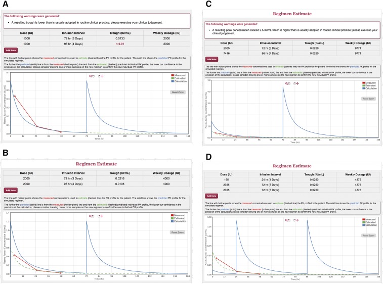
Figure 4.
Individualized plasma clotting factor activity over time profile: case 2. The red line with hollow points shows the measured plasma clotting factor activities used to estimate the PK profile for the patient (green dashed line). The solid line shows the predicted PK profile for the simulated regimen. The further away the predicted (solid) line is from the measured (hollow point) line and from the estimated (dashed) predicted individual PK profile, the lower our confidence in the precision of the calculation. (A) Individual PK profile on the current dose of 1000 IU on Monday and Thursday. (B) The effect of increasing the dose to 2000 IU. (C) The dose that would be required on the Friday infusion to obtain a trough >0.025. (D) The booster dose that would be required on Sunday to obtain a trough >0.025. The plots were produced with the calculator function of the WAPPS-Hemo software, a freely available, registration-based online tool providing individualized PK profiles using a Bayesian population approach (www.wapps-hemo.org). The interactive graph relative to this example is available at https://demo.wapps-hemo.org/PatientResult.aspx?PIR=pVyUp4UHO0ib9GzrozEx2g, and the interactive graph relative to case 3 is available at https://demo.wapps-hemo.org/PatientResult.aspx?PIR=QYLy46pQOGEEn9PewiBvHA.

