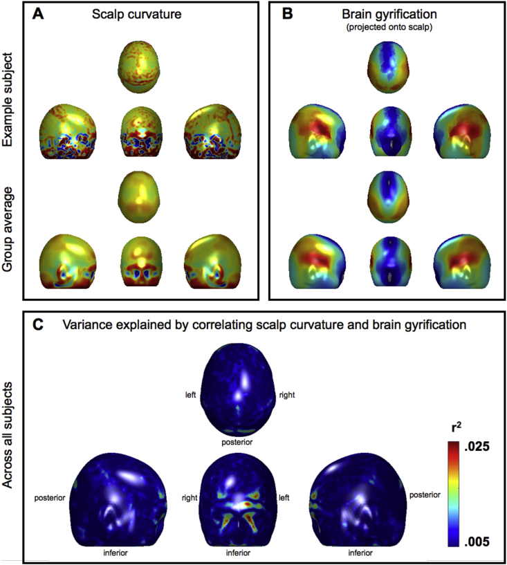
Fig. 4.
Scalp curvature, brain gyrification, and the variance explained by correlating the two. Panel A: Example scalp curvature data from a single subject (upper panel) and averaged over the entire cohort (lower panel). Red/Blue represents positive/negative (i.e. convex/concave) curvature values. Panel B: Example brain gyrification projected onto the scalp for a single subject (upper panel) and averaged over the entire cohort (lower panel). Red/Blue represents degree of gyrification (note large index values, in red, laterally over the Sylvian fissures). Panel C: Variance explained by correlating scalp curvature and brain gyrification. Note that the r2 values are very small; the “strongest” effects only explain about .025% of the variance (leaving 97.5% unexplained). The largest “effects” are also marginalised to the facial region, which is irrelevant to a great number of phrenological accounts and probably an artefact. All data have been projected onto the mean head surface.

