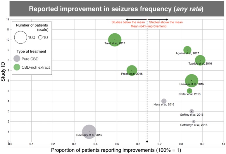
Figure 2.
Scatterplot diagram of treatment efficacy, according to the data of “clinical improvement” reported in the aforementioned clinical studies. The X-axis represents the rate of clinical improvement (from 0 to 1, 100% = 1). The Y-axis is arbitrary “Study ID.” The size of each point represents the number of patients included in the study and gives an idea of the “weight” of each study. The dotted line is the average, regardless of treatment. Each type of treatment (Purified CBD vs. CBD-rich extracts) is coded with a different color, according to the legend. Same data as Table 1, except for one study (10) due to unreported data.

