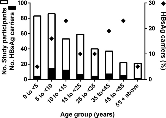
FIG 1.
Age distribution of HBsAg carriers among study participants of Mbandji 2. A stacked graph illustrating the number of HBsAg carriers among the total number of study participants for each age group (left y axis) is shown. Diamonds represent the percentage of HBsAg carriage for each age group (right y axis).

