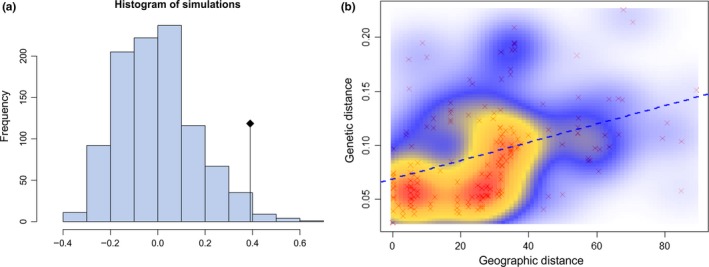
Figure 6.

Isolation‐by‐distance plots for all pairs of populations from continental Africa. Statistical significance was evaluated through a Mantel test as implemented in the “ade4” R package. The original value of the correlation between the two matrices (geographic distance and genetic distance) is represented by a dot, while the histogram (a) represents the permutated values assuming the absence of spatial structure. Significant spatial structure results in the original value being out of the reference distribution. The correlation between geographic and genetic distance was plotted using the R package “MASS.” The scatterplot (b) shows one single consistent cloud of points. The colored gradient from light blue to red indicates the density of the points which are also shown as red points in the background of the graph. The blue dashed line represents the regression line between the geographic and genetic distance
