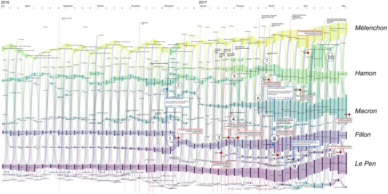
Fig 7. Reconfigurations of political communities between June 2016 and April 2017.
Several major newspaper headlines have been added to shed light on the observed bifurcations. The labels of communities that were still active during the second round have been added in large characters to improve their readability. Each vertical bar corresponds to a political community on Twitter, labeled with the accounts of candidates who were active in the community. The bar’s height is proportional to the number of Twitter accounts belonging to this community. These are computed every Monday.

