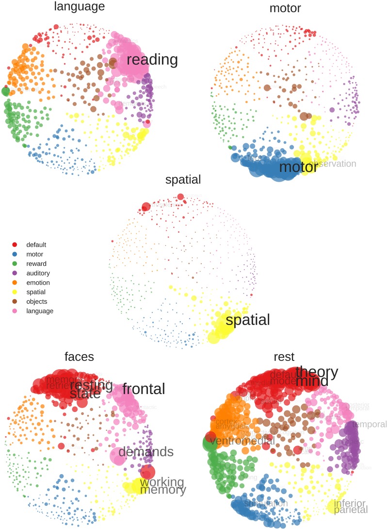
Fig 5. NeuroSynth decoding of average activity map for each training condition (averaged over both training runs).
Stronger correlations with a keyword are indicated by a bigger circle, bigger font size and less transparency of font. To improve readability, the correlations are min-max scaled, so that the largest correlation is always of the same pre-defined size. Furthermore, the sizes of the scaled correlations have been multiplied with an exponential function, so that large correlations appear larger and small correlations smaller than they actually are (sizes are more extreme that the underlying data). To further enhance readability, if two keywords were too close in space so they would overlap, only the higher correlating keyword was printed. Color assignment is based on K-means clustering of the NeuroSynth data.

