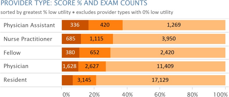
Fig. 3.
Screenshot of single pane from CDS dashboard demonstrating visualization of ordering department-specific percentages of exams of varying degrees of appropriateness. For confidentiality in this manuscript, the department names are obscured. One department demonstrated 54% of exams of low utility, whereas others (not shown) had only 5% or less exams of low utility. This type of visualization could lead to exploration of these results and if warranted, clinical or technical intervention

