. 2018 Aug 20;7:e37017. doi: 10.7554/eLife.37017

Figure 3. Characterization of calcium transients observed in response to o stimulation.

(A and B) Summary of different response types. Stimulation is indicated by the gray bar and consists of 20 light pulses (50 μW/mm2, each of 2 ms duration) delivered at 30 Hz. (A) Example neuron pairs, easily interpretable responses. (B) Example neuron pairs, responses that are more difficult to interpret. In A and B, all responses, expressed as ΔF/F0, are baseline subtracted except for the inhibitory response in Aii. Scale bar 2 s. Grey dashed boxes show the region of overlap between the two patterns, and yellow boxes indicate the area that was generally imaged for the pairs shown. (C) Example of statistics computed on individual runs and cell pairs characterizing: (i) average response shape, (ii) reliability of the response, and (iii) response sensitivity. (D) Using the distribution of statistics from non-overlapping controls to assign classes to the responses: distributions of response amplitudes and reliability as measured by the scaled normalized integral (the median of the integral normalized to the baseline and scaled so that the dataset spans the [−1,1] range) and the between-flies correlation (see Materials and methods). Each point corresponds to a different cell pair (median statistics across flies). Control unconnected pairs are shown in blue, and self-activation (CsChrimson and GCaMP6m expressed in the same neuron type) in orange. Responses considered significantly different from the control sample (p<0.01, see Materials and methods) are circled.

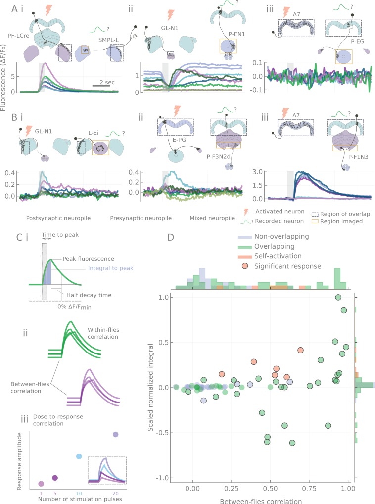
Figure 3.

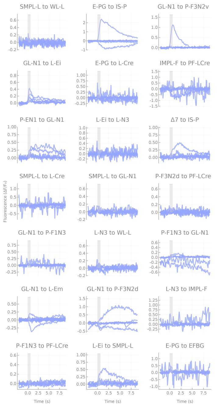
Figure 3—figure supplement 1. Responses of non-overlapping pairs.

Figure 3—figure supplement 1.

Responses of non-overlapping pairs. Each line corresponds to a fly (six flies per pair), each panel to a cell pair tested. Note that when responses are present, they are either unreliable or small, and likely reflect effects of indirect connections.
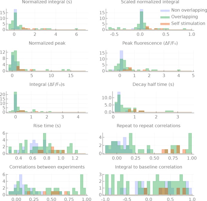
Figure 3—figure supplement 2. Distributions of the measured statistics for the different groups.

Figure 3—figure supplement 2.

Distributions of statistics computed for non-overlapping, overlapping and self-activation pairs. All statistics are the median per pair of per run statistics. Integral: the integral of the response (from the onset of stimulation to the time of the peak of the response), in ΔF/F0s. Normalized integral: Integral divided by the baseline fluorescence. Scaled normalized integral: the normalized integral divided by the maximum (minimum for inhibitory responses) normalized integral measured. Peak fluorescence: the maximum (minimum for inhibitory responses) of the fluorescent transient ΔF/F0. Normalized peak: the peak fluorescence divided by the baseline fluorescence. Decay half time: the time in seconds between the peak of the response to the moment where the fluorescence reaches half the level of the peak (relative to the baseline). Rise time: the time of the peak fluorescence (in seconds). Repeat to repeat correlations: the average correlation between several repeats of the same experiment (in the same fly). Correlations between experiments: the average correlation between experimental runs of the same pair but from different flies. Integral to baseline correlation: the correlation between the integral and the value of the baseline fluorescence.
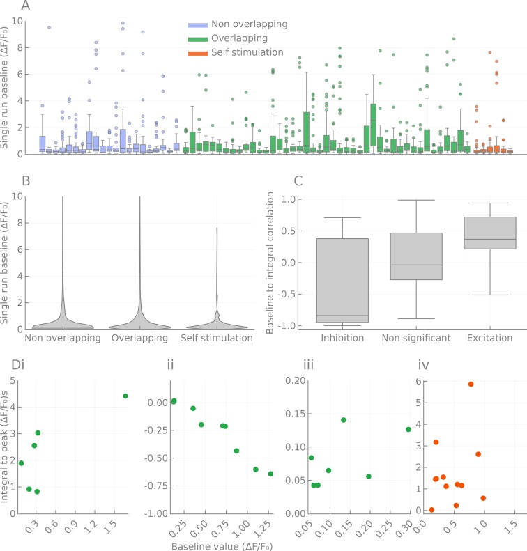
Figure 3—figure supplement 3. Effects of baseline fluorescence fluctuations on responses.

Figure 3—figure supplement 3.

Spread of fluorescence baseline, effect on the responses. (A) Distribution of baseline fluorescence for each cell pair tested. Pairs are colored according to the ‘anatomical’ class they belong to (overlapping, non-overlapping and self-activation). (B) Same as A, but pooled by class and rendered as a violin plot. (C) Correlations between the signed response distance and the baseline fluorescence intensity of significantly responding pairs. Inhibitory responses are (as expected) correlated, but excitatory pairs also show a mild correlation. (D) Example of distance to baseline relationship in four pairs. (i) PF-LCre to SMPL-L, corresponding to Figure 3Ai. (ii) GL-N1 to P-EN1, corresponding to Figure 3Aii. (iii) GL-N1 to L-Ei, corresponding to Figure 3Aiii. (iv) PF-LCre to PF-LCre.
Figure 3—video 1. PF-LCre to SMPL-L response, also shown in Ai.
Download video file (1MB, mp4)
DOI: 10.7554/eLife.37017.012
Top left: average projection of the fluorescence movie with the outline of the ROI used to calculate the fluorescence. Top right: cell pair considered. The red box outlines the approximate location of the region imaged.
Figure 3–video 2. GL-N1 to P-EN1 response, also shown in Aii. .
Download video file (2.1MB, mp4)
DOI: 10.7554/eLife.37017.013
Figure 3–video 3. E-PG to PF-LCre response, not shown in figure.
Download video file (539.1KB, mp4)
DOI: 10.7554/eLife.37017.014