
Figure 1. Illustration of gut motility analysis.
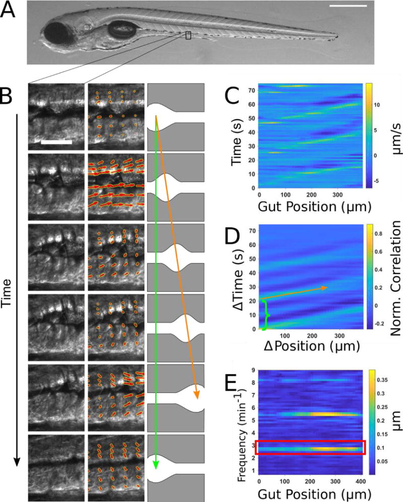
(A) Brightfield image of a 6 dpf zebrafish larva. Scale bar: 500μm. (B) Left column: a representative series of DIC images of a small region of the midgut. Scale bar 25 μm. Center column: the velocity vector field (red arrows) obtained by performing Particle Image Velocimetry (PIV) on the image series. Right column: schematic illustration of coordinated movements from left to right (anterior to posterior). Wave speed is indicated by the slope of the orange arrow and periodicity indicated by the extent of the green arrow. (C) Quantitative Spatiotemporal Maps (QSTMaps) are obtained by averaging the anterior-posterior component of the velocity vector field along the dorsal-ventral direction and then plotting the curve over time. The color axis represents the velocities, with positive and negative values denoting posterior and anterior movement, respectively. (D) An averaged cross correlation of the QSTMap more clearly reveals motility parameters. The period of motility events corresponds to the time of the first local maximum at ΔPosition = 0 autocorrelation (green bracket; analogous to the length of the green arrow in Fig. 1B). The wave speed corresponds to the inverse slope of maxima in the plot (orange arrow; analogous to the orange arrow in Fig. 1B). (E) A power spectrum of the QSTMap shows the magnitude of gut motion at various frequencies. The amplitude of motility events is determined from the average of the power spectrum at the motility frequency (red box).