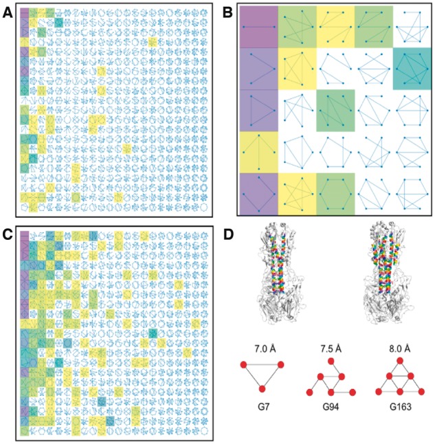
Fig. 4.

The Atlas of Coiled Coils. (A) Static image of the interactive visualization of the classification data. An array of cartoon representations of mathematical graphs is shown, each representing one category in the classification scheme. Categories that are populated at fixed values of scut (7.0 Å) and kcut (3) are highlighted with shaded boxes: darker shades correspond to larger numbers of extant structures. (B) Close-up of the 25 graphs in the top left corner of (A). (C) As in (A), but with scut = 9.0 and kcut = 0. (D) Top: The structure of hemagglutinin (4bsa) (Xiong et al., 2013), with coiled-coil helices at 7.0 Å (left) and 8.0 Å (right) highlighted in colour. Images generated using PyMOL. Bottom: The associated coiled-coil graphs are shown at the indicated values of scut (kcut = 2 in each case) (Color version of this figure is available at Bioinformatics online.)
