
Figure 5.
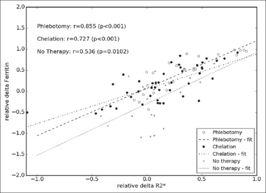
Correlation between relative changes of hepatic R2* measurements and serum ferritin levels. In this figure, the same data as in Figure 3 are shown; however, taking into account the different applied therapies, the shown lines represent the best linear fit to the respective data: dashed line – phlebotomy data; dash-dotted line – chelation; and dotted line – no therapy.