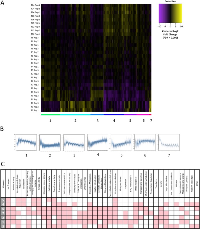
FIG 4.
Clustering of expression over time. (A) Heat map displaying differentially expressed genes. Expression levels are plotted in log2, space and mean centered (FDR of <0.001) across the entire time course. k-means clustering has partitioned genes into 7 clusters, as indicated by colored bars and numbered graphs below the heat map. (B) Graphs displaying cluster expression over time (0 to 24 h). (C) Table displaying categories enriched (hypergeometric test, corrected P value of <0.05), indicated in red, for clusters 1 to 7.

