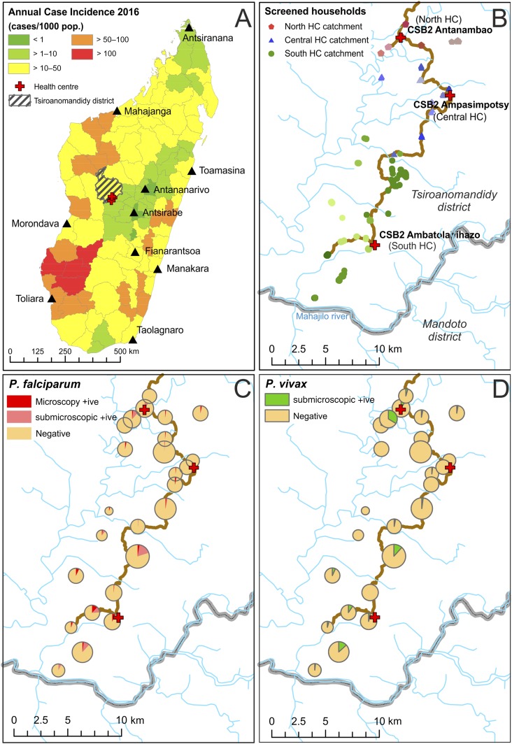
Figure 1.
Study site map and distribution of diagnosed infections. (A) The study site location (red crosses), with the hatched polygon representing Tsiroanomandidy district. Background districts are colored categorically by annual case incidence estimates for 2016 (source: National Malaria Control Program of Madagascar). (B) A higher resolution map of the study region, with the principal access track marked in brown, health centers denoted by red crosses, and households colored by village and by health center catchment area. (C and D) Observed Plasmodium infection prevalence by village. Pie chart sizes reflect the number of individuals tested by village (range: 21–179). This figure appears in color at www.ajtmh.org.

