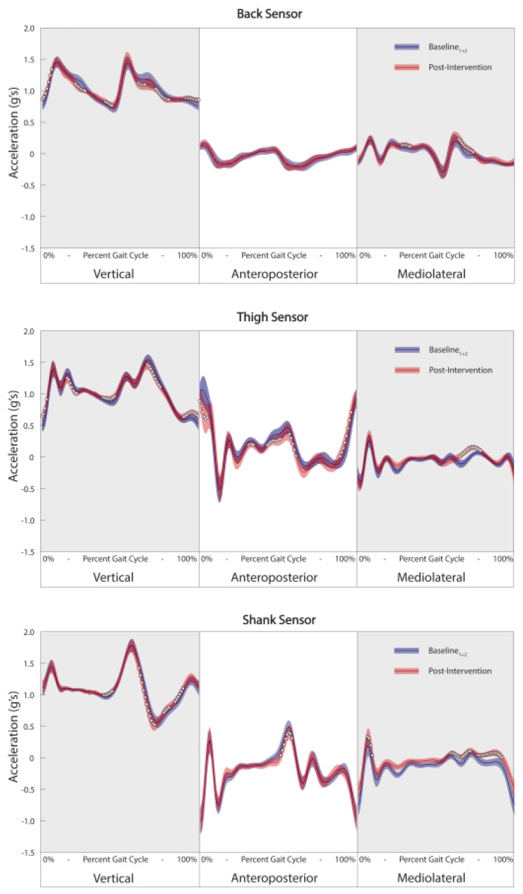
Figure 4.
Example of waveform analysis of three-dimensional linear accelerations from the back (top), thigh (middle) and shank (bottom) visualizing changes in post-intervention data (red line) compared to baseline data (blue line). Data is presented from the patient who demonstrated the greatest number of gait cycle outliers post-intervention. White circles represent areas of the waveform where differences between baseline and post-intervention data are statistically significant (Holm-Bonferroni corrected p-value of less than 0.05) and have a large effect size (Cohen’s d > 0.8).

