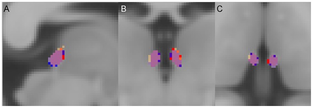
Figure 2.

Group average habenula (Hb) probability maps. (A) Sagittal, (B) coronal, and (C) axial views. For each diagnostic group, the Hb probability map represents the average of the participants' unthresholded Hb maps. The overlap of the maps between the three diagnostic groups is shown in purple. For visualization a threshold of 0.1 (10%) was applied. Red = Hb probability map of the patients with schizophrenia, Orange = Hb probability map of the patients with bipolar disorder, Blue = Hb probability map of the healthy individuals.
