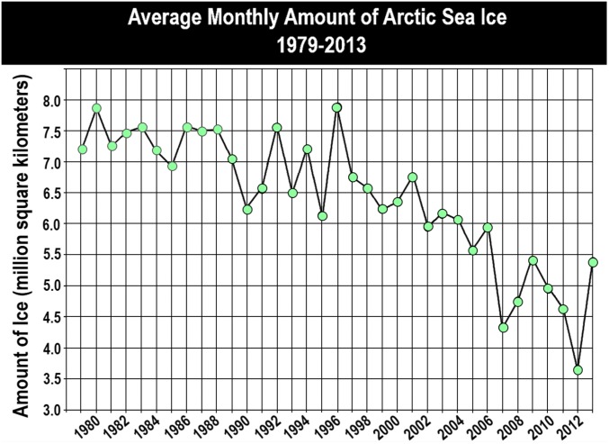
Fig. 1.
NASA graph used as a stimulus in the online experiment. This graph was adapted from NASA’s 2013 public communications about climate change. The graph has been found to produce misinterpretations about the scientific information it communicates because its final data point indicates an increase in the amount of Artic Sea ice in the opposite direction of the overall trend that NASA intended to communicate. Data from ref. 6.

