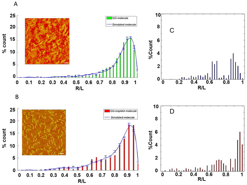
Figure 5.

Matching simulated and experimental data. R/L distributions of experimental AFM data (bar chart) and simulated molecules (blue line). (A) Untreated DNA; (B) cisplatinated DNA with single GG-adduct in the middle of the strand. The error bars represent the percentage standard error of the mean (SEM) of the number of simulated DNA molecule in each bin. The error in the experimental data is estimated to be 10%, or less (see Discussion). (Insets) AFM images of untreated DNA and cisplatinated DNA; scale bar is 100 nm. (C) & (D) Differences in the R/L distributions between the untreated and cisplatinated DNA. (C) Difference between the measured distributions shown in (A) and (B). (D) Difference between the curve fits shown in (A) and (B). The distributions were first normalized and then subtracted from each other.
