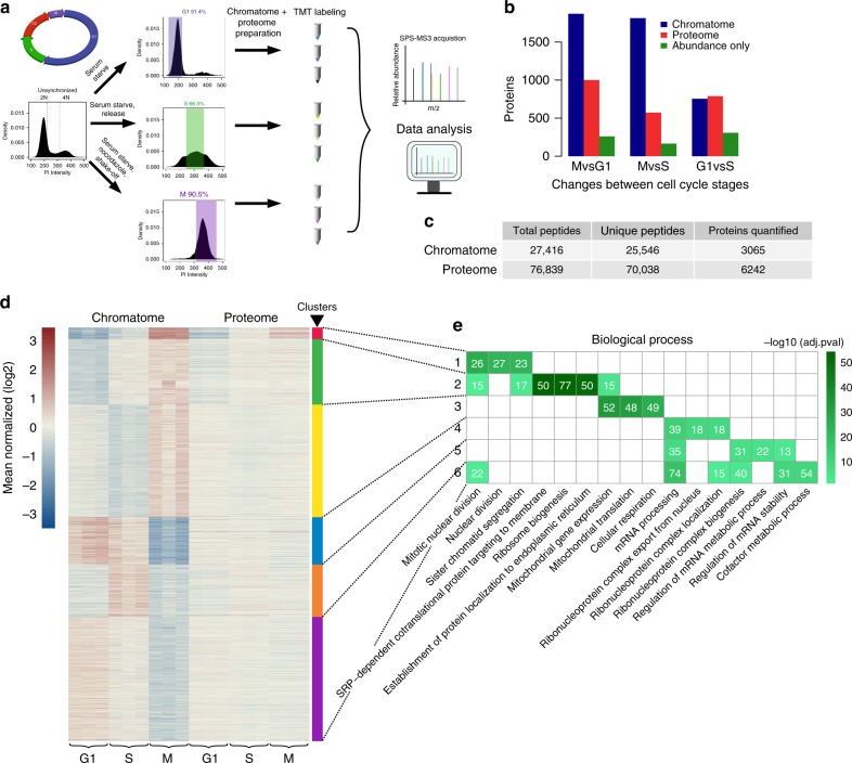
Fig. 2.
Changes in chromatin association across the cell cycle. a Outline of experimental procedure. Density plots represent propidium iodide staining of cellular DNA content (2N = diploid copy number). Cutoffs for G1, S, and G2/M are represented by blue, green, and purple colored boxes, respectively. Synchronization procedures are noted above arrows. b Total number of significantly changing proteins between cell cycle contrasts (p ≤ 0.001 and fold change ≥ 1.5, see Methods for significance determination), for proteome (red) and chromatome (blue) samples. Green bar represents those proteins where changes in chromatome correlate significantly with changes in proteome, and thus can be explained by protein abundance. c Number of proteins and peptides detected and quantified in proteome and chromatome. d Clustering of significantly changing chromatome proteins using affinity propagation clustering. Scale represents mean- normalized intensities after log2 transformation. Clusters are denoted by colored bars on the right with their respective numbers. e The top three biological process ontology terms associated with each cluster in d colored by −log10(adjusted p-value). Numbers in brackets represent number of proteins belonging to that category in the respective cluster as in 1e

