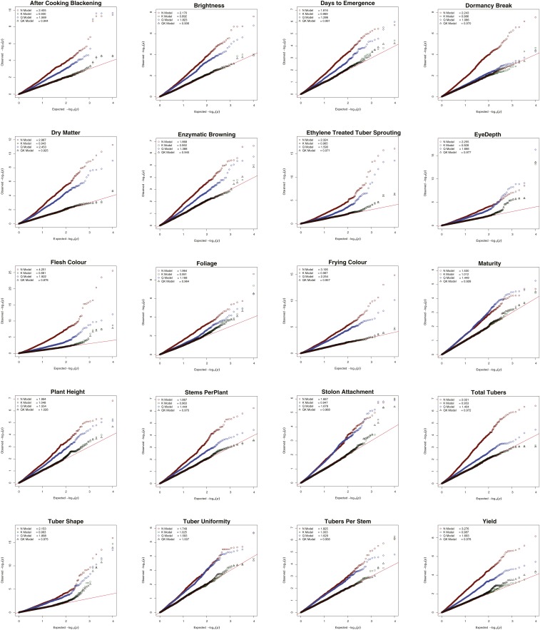
Figure 8.
Q-Q plots comparing the inflation of p-values for the four principal GWAS models for all 20 traits using the additive marker model. Red circles: Naïve model; Green squares: K model; Blue diamonds: Q model; and Black triangles: QK model. Red line indicates p-values under the expected normal distribution.

