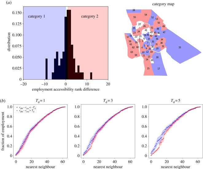
Figure 4.
In (a), we show the distribution of the values of the Δr, and a map of the spatial distribution of the zones. The blue zones highlight zones in category 1, the white area zones in category 0 and the red in category 2. In (b), we show the average distance to employment of zones in categories 1 and 2. For bigger values of Td, we compare zones of increasing difference in the performance using the two models. The shaded areas represent the standard deviation of the distribution.

