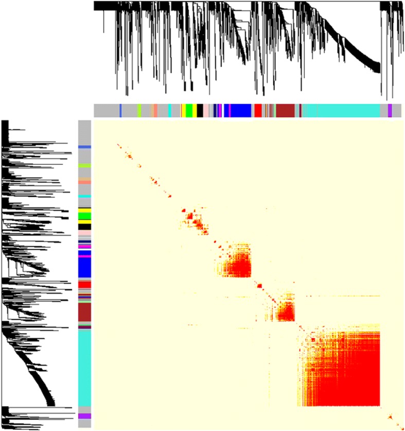
Fig. 3.

Visualizing the gene network for RNAseq dataset using a heatmap plot. The heatmap depicts the Topological Overlap Matrix (TOM) among all genes in the analysis. Light color represents low overlap and progressively darker red color represents higher overlap. Blocks of darker colors along the diagonal are the modules. The gene dendrogram with dissimilarity based on topological overlap and module assignment are also shown along the left side and the top
