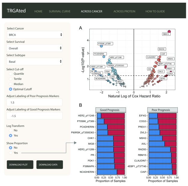
Figure 3. Visualizing all proteins across a single cancer type.
The interface shows an example of the visualization of Cox hazard ratio of each protein across the basal subtype of breast cancer ( A). Good prognostic markers appear on the left in blue, while poor prognostic markers are on the right in red. The natural log transformation allows the graph to be centered at 0 and makes the visualization of good prognostic markers easier. Labeling for proteins can be adjusted to include more or less protein. Proportional comparisons for protein using the optimal cutpoint function is available as well ( B).

