Figure 3.

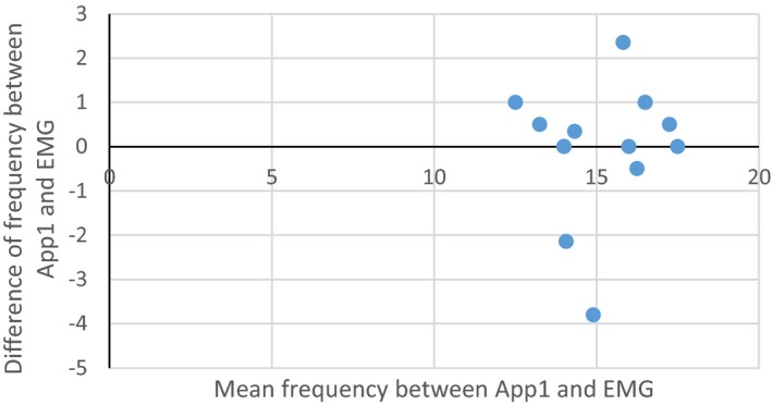
Bland‐Altman plot showing average frequency between App1 result and EMG report on x‐axis verses the difference between the frequency on App1 and EMG report on y‐axis for each subject with all the available data.

Bland‐Altman plot showing average frequency between App1 result and EMG report on x‐axis verses the difference between the frequency on App1 and EMG report on y‐axis for each subject with all the available data.