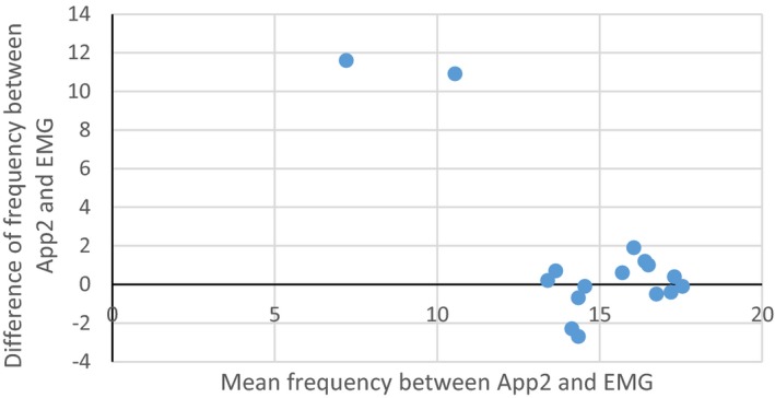
Figure 4.

Bland‐Altman plot showing average frequency between App2 and EMG report on x‐axis verses the difference between the frequency on App2 and EMG report on y‐axis for each subject with all the available information. We used the highest reported frequency on App2 of the three axes. The two outliers are both subjects with EMG results in the OT tremor frequency range but tremor frequencies lower than OT range in all axes using App2.
