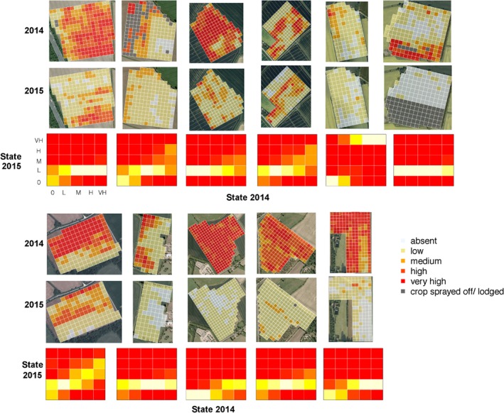
Figure 2.

Examples of field‐scale distributions of weeds in successive years, together with fitted transition matrices (see text for details of the fitting method). All fields shown were rotated from winter wheat to spring barley between 2014 and 2015. The transition matrices are represented as heat maps (red, low probability; yellow and white, high probability).
