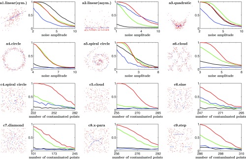
Fig. 3.
In each pair of panels, Left shows the model and the data, and Right shows the power of tests at significance level : Models a1–a6 with additive noise are in Upper panels, and models c4–c9 with contaminated noise are in Lower panels. For power curves, correspondence between colors and different methods is as follows: red for JMI, green for HHG, blue for MIC, and black for dCor.

