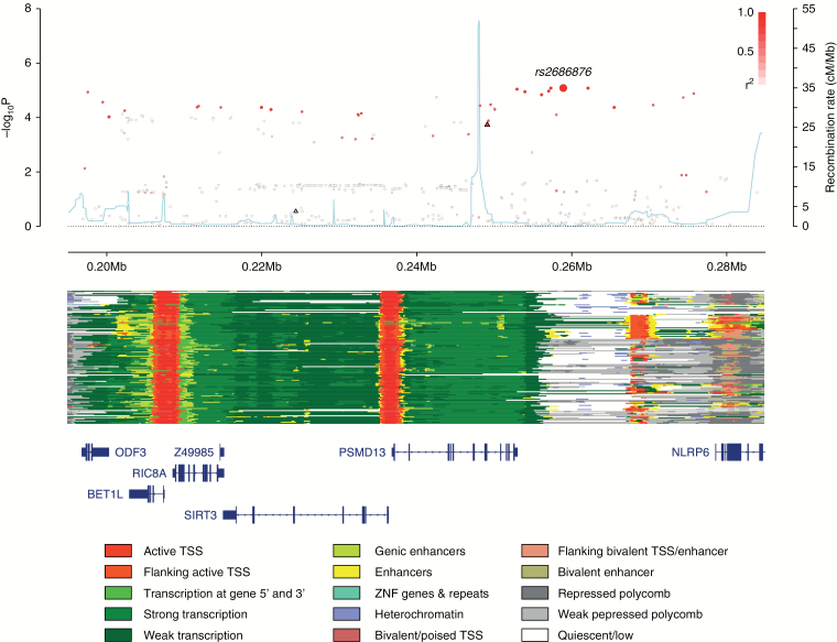
Fig. 3.
Regional plot of the 11p15.5 association. Plot (drawn using visPig48) shows association results of both genotyped (triangles) and imputed (circles) SNPs in the GWAS samples and recombination rates; −log10P-values (y-axis) of the SNPs are shown according to their chromosomal positions (x-axis). The sentinel SNP is shown as a large circle and is labeled by its rsID. The color intensity of each symbol reflects the extent of linkage disequilibrium with the top genotyped SNP, white (r2 = 0) through to dark red (r2 = 1.0). Genetic recombination rates, estimated using 1000 Genomes Project samples,19 are shown with a light blue line. Physical positions are based on National Center for Biotechnology Information (NCBI) build 37 of the human genome. Also shown are the chromatin-state segmentation tracks for 127 cell types and tissues from ENCODE and the Roadmap Epigenomics Consortium,49 generated using ChromHMM50 and the Wash U Epigenome Browser,51 and the positions of genes and transcripts mapping to the region of association. ANO9 is located 128 kb centromeric of the plotted region.

