Figure 3.
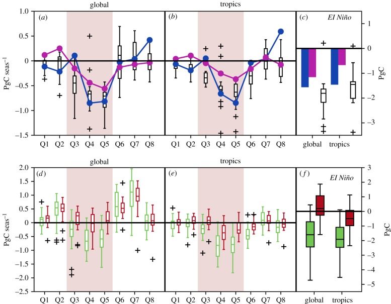
Evolution of carbon cycle anomalies during the 2015/2016 El Niño event. (a–c) Seasonal NBPanom between January 2015 and December 2016 estimated by CAMS (dark blue) and CarboScope04 (magenta) and LSMs (boxplots indicate the model distribution) for the globe (a) and the tropics (b) and integrated values during El Niño, i.e. the sum of anomalies during Q3–Q5, indicated by the light red-shades ((c), bars for inversions and boxplots LSMs). (d–f): seasonal GPPanom (green) and TERanom (red) for the globe (d) and tropics (e) from LSMs during 2015–2016 and integrated during El Niño (f). The boxplots show the inter-quartile range (IQR) and median of anomalies estimated by LSMs, the whiskers the interval corresponding to 1.5 IQR and + markers indicate outliers.

