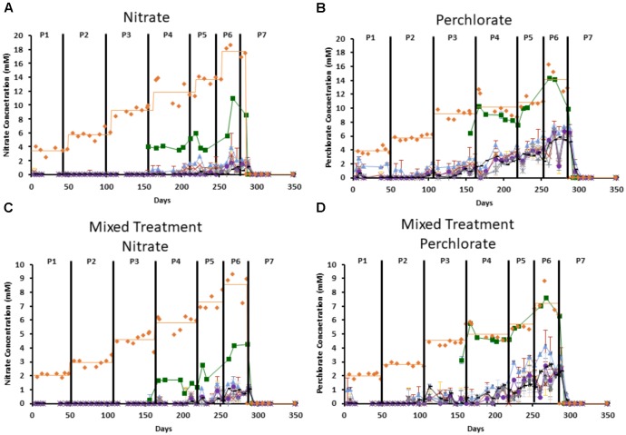
FIGURE 2.
Measured influent concentration of each inhibitor throughout the columns. Orange diamonds represent the influent concentration and the orange line represents the average influent concentration during each treatment phase, green boxes represent port 1, blue triangles represent port 2, red “x”s represent port 3, yellow “∗”s represent port 4, purple circles represent port 5, gray “ + ”s represent port 6, and black “-”s represent port 7. Treatment phases (1–7) are indicated by the black lines and labeled as P1–P7. (A) Is nitrate concentration in the nitrate only columns, (B) is perchlorate concentration in the perchlorate only columns. (C,D) Represent the nitrate concentration (C) and perchlorate concentration (D) in the mixed treatment columns. Error bars represent standard deviation of triplicate samples with the exception of influent, which only has a single measurement at each time point.

