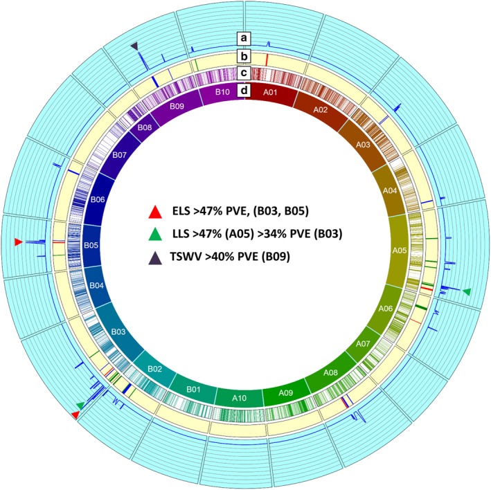
Figure 2.

Genetic and QTL map of all the identified QTLs comprising SNP and SSR markers in the T‐population. (a) It represents the LOD values from 0 to 20 at an interval of 2 for each QTL, (b) it represents the QTLs identified in the study, (c) it represents the cM position of the SNP and SSR markers on the genetic map, and (d) it represents the LGs generated in the genetic map. Red corresponds to ELS QTL, green corresponds to LLS QTL, and black corresponds to TSWV QTL.
