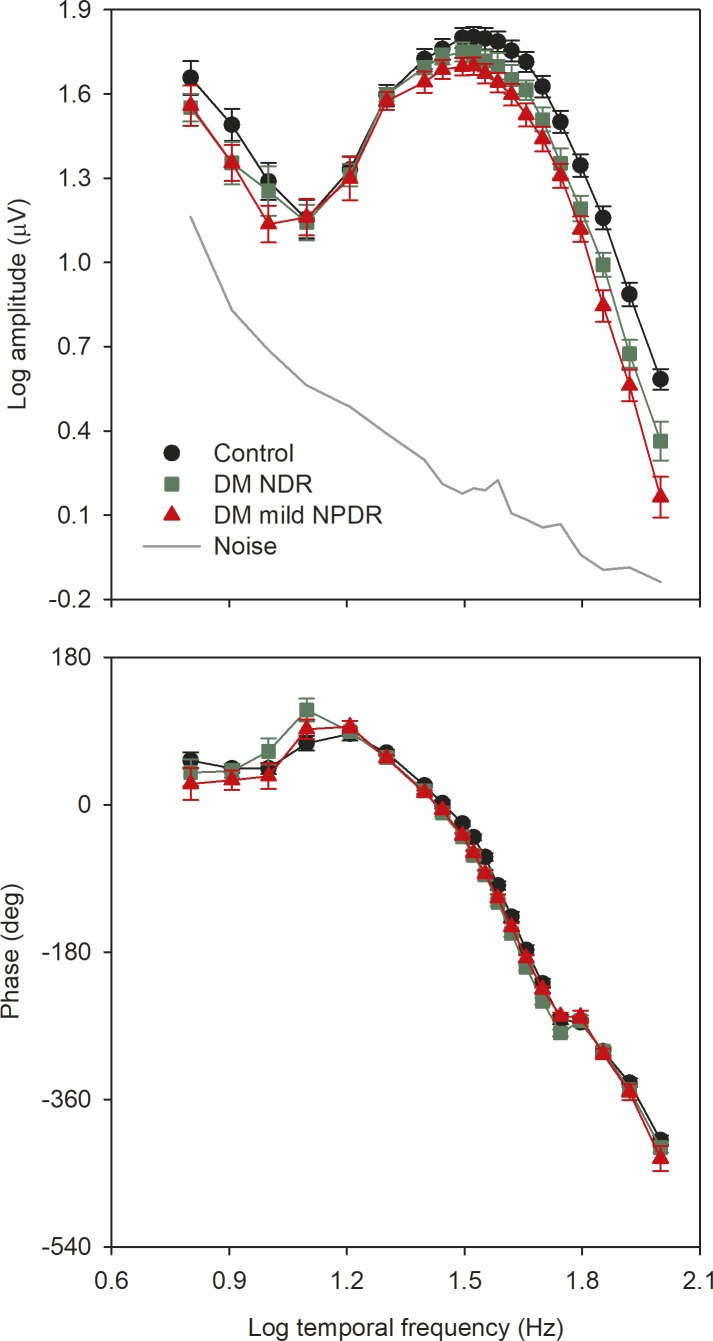
Figure 2.
Mean (±SEM) log fundamental amplitude (top) and phase (bottom) as a function of log stimulus temporal frequency. Control subjects are shown in black, diabetics with NDR are shown in green, and diabetics with mild NPDR are shown in red. The gray line represents the noise level, as described in the text.

