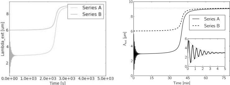
Fig 6. The same two synthetic time series Λext plotted in two different ways.
Compared to the right plot, the left plot is of rather poor design and quality. The text in the plot is inconsistent with the rest of the manuscript (symbols like Λ and μ), numbers are unnecessarily hard to read and not in intuitively understandable units, the two curves of originally different color are indistinguishable in this simulated printout on a black and white printer; the legend occludes part of the data, the possibly interesting oscillation is of the lower curve hard to see and raises more questions than it answers; the range of values starts at almost (but not quite) zero; the image is rather blurred and contains lots of artifacts due to low resolution, resampling, and (lossy) jpeg image compression. In contrast, the right plot is crisp and clear, additionally shows the asymptotic value attained by both data series, and shows a zoom to how the damped initial oscillation of data series A (here, we can actually tell which one is which).

