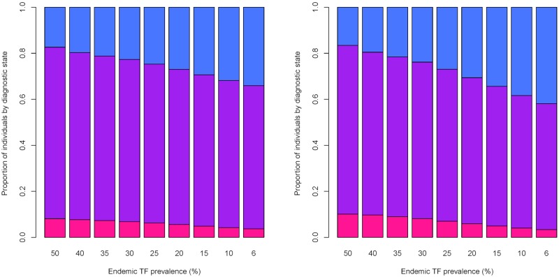
Fig 4. Changes in the proportion of individuals positive in each diagnostic state, pre and post MDA for different initial endemic levels of TF prevalence.
On the left is the proportion of individuals positive in each diagnostic state prior to MDA occurring: pink—PCR positive only, purple—PCR and TF positive, blue—TF positive only, each x axis label indicates what the initial endemic prevalence was in the community prior to intervention. On the right is the proportion of individuals in each diagnostic state following 3 annual rounds of MDA for each initial level of endemic prevalence (as shown on the x label), again pink—PCR positive only, purple—PCR and TF positive, blue—TF positive only. At high levels of initial endemic prevalence we see the highest proportion of individuals test both PCR and TF positive as a result of rapid rates of re-infection within the community, while at lower levels of prevalence a high proportion of TF only individuals were present due to lower rates of re-infection. Changes in the proportion of individuals positive in each diagnostic state were more apparent for initial endemic prevalence’s lower than 25%.

