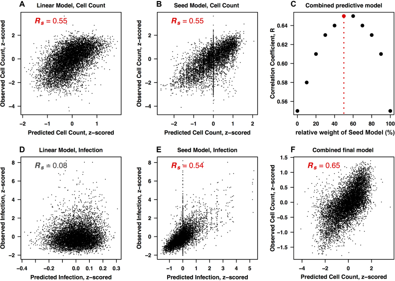
Figure 4.
Combined modeling to increase the predictive power. (A, B) Performance of the two individual models for predicting the cell growth phenotype, trained (A) on individual nucleotide positions, and (B) on 7-mer seed sequences at position 2–8. (D, E). Corresponding plots for the infection phenotype. Plots show correlations between the observed and predicted phenotypes. (C) Combining seed model and linear nucleotide model predictions to find the best possible combination of the two models for maximum prediction power. Each data point represents the correlation between the observed and combined prediction from both models. The combined prediction is calculated by combining the prediction output from both models in different percentages (the x-axis shows the weight percentage of the linear model). (F) Combined final model. Correlation plot between the observed and the combined prediction from both models. The prediction output is a combination with 50% contribution from both models.

