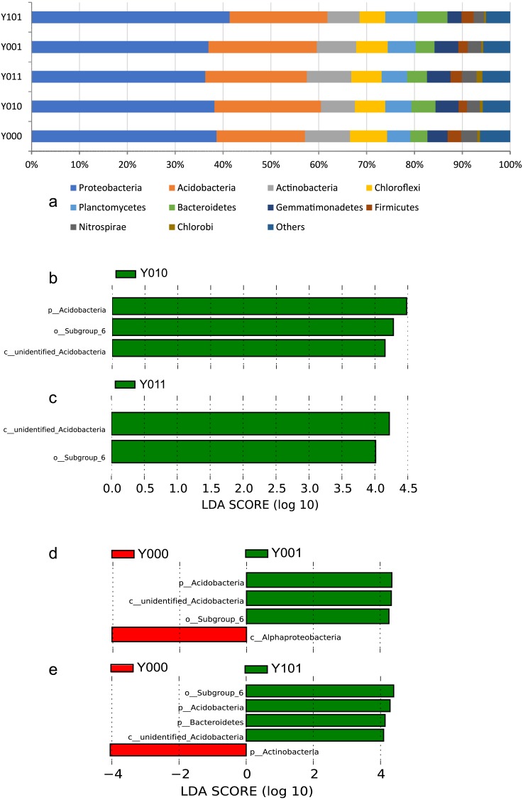
Figure 1. Bar chart of bacterial relative abundance at the phylum level and bar chart based on the LDA value.
(A) Bar chart of bacterial relative abundance at the phylum level. Bar chart based on the LDA value, bacterial community groups in comparison pairs with significant differences (LDA score > 4) in abundance are shown. Comparison pairs: (B) Y010/Y000, (C) Y011/Y000, (D) Y001/Y000, (E) Y101/Y000.

